A Custom View Assist Dashboard for an Amazon Echo Show 5
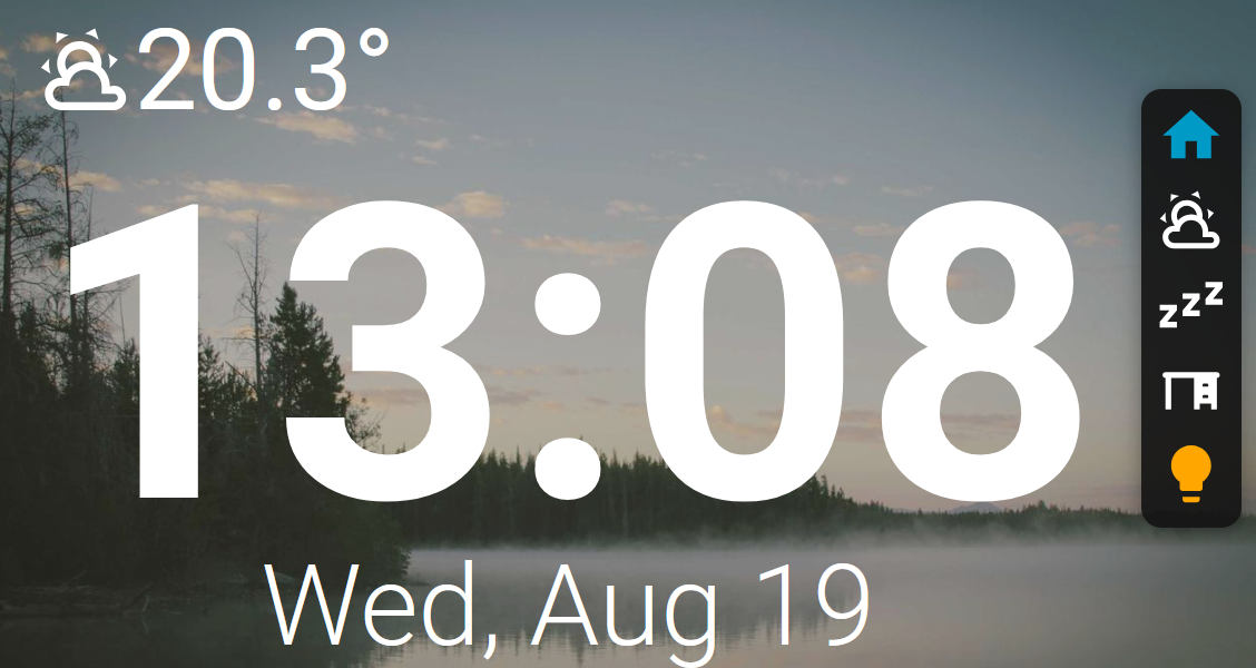
After watching this this dashboard video. I wanted to set up a similar bedside dashboard, with an always-on Home Assistant display. View_assist looks quiet nice as a bedside dashboard, but its primarily designed to be voice activate. I wanted something would be mostly touch activated with a side menu.
A quick warning: I am new to View Assist and this is an experimental personal setup. Back up your existing View Assist dashboard before replacing anything. Copy the complete contents of the Raw configuration editor and save them somewhere safe so you can restore the dashboard if necessary.
Prepare the Echo Show 5
An Amazon Echo Show does not provide a normal way to run a custom Home Assistant dashboard. The device must first be jailbroken and prepared to run View Assist. I have not repeated those instructions here because Mark Watt Tech already provides really nice detailed walkthroughs.
Follow the applicable tutorial carefully and confirm that the standard View Assist dashboard works on the Echo before installing this customized dashboard.
Install the dashboard
Before importing it:
- Install and configure View Assist.
- Confirm that the standard View Assist dashboard loads on the Echo.
- Install View Assist’s required Lovelace dependencies through HACS, including Button Card, Layout Card, and Card Mod.
- Installed the custom view-assist-menu-card
- Modify the View Assist dashboard
- Create the Lovelace dashboard
Installed the custom view-assist-menu-card
We need to create a small custom Lovelace card. This card can be used on both the View assist dashboard and the custom lovelace dashboards.
- Reads
menu_itemsfrom the active View Assist device. - Creates an always-visible menu on the right side of every View Assist view.
- reduce the width of the standard screens so they are not behind the menu.
- Shows light icons in yellow while the light is on.
Save the below file to you Home Assistance:
- save as: :
/local/view-assist-menu-card.js
Register it through the Home Assistant UI:
- Open Settings → Dashboards.
- Select the three-dot menu in the upper-right.
- Select Resources.
- Select Add resource.
- Enter:
/local/view-assist-menu-card.js?v=1 - Select JavaScript module as the resource type.
- Select Create.
Then perform a hard refresh on the browser:
- Desktop: Ctrl+F5
- Echo/browser display: reload the page or restart its browser app
You can how use the *view-assist-menu-card where its needed.
Modify the View Assist dashboard
Do not edit .storage/lovelace.view_assist directly. View Assist uses a Home Assistant storage-mode dashboard, so dashboard changes should be saved through the Raw configuration editor.
- Open the View Assist dashboard in Home Assistant.
- Select Edit dashboard from the three-dot menu.
- Open the three-dot menu again and select Raw configuration editor.
- Copy the current configuration into a backup file.
- Replace the editor contents with the contents of the yaml below and save.
- Refresh or restart the browser on the Echo Show.
Create the Lovelace dashboard
- Create a new Lovelace dashboard
- Add the view-assist-menu-card the dashboard
Configure the side menu
The side menu reads its entries from the View Assist entity associated with the device displaying the dashboard. The modified View Assist dashboard and the sample room Lovelace dashboard both use this same menu configuration. This allows the kitchen, study, bedroom, or other View Assist devices to have different menus without maintaining the menu entries separately on each dashboard.
Configure a device from:
Settings → Devices & services → View Assist → your device → Dashboard options → Display settings → Menu Items
Enter the items in the order you want them displayed. The first configured item appears at the top of the vertical menu.
Navigate to a View Assist view
view:weather|weather-partly-cloudy
The first value is the destination and the value after | is the Material Design icon name. Do not include the mdi: prefix.
Open another Home Assistant dashboard
view:/dashboard-myroom/0|view-dashboard
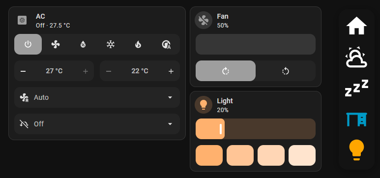
For this, I create a small dashboard for each room that has an Echo. The dashboard provides access to the smart devices in that room, such as the air conditioner, lights, and fan. A destination beginning with / is treated as an absolute Home Assistant path. This is not as smooth as navigating between View Assist views. Opening a separate Lovelace dashboard reloads the whole page, and returning to View Assist reloads it again.
The sample room dashboard below includes a side-menu card that reads menu_items from the active View Assist device. Add this card to each separate Lovelace dashboard where you want the shared menu to appear. The card configuration stays the same; changes made under the device’s Menu Items setting are then reflected in both the View Assist dashboard and the room dashboard.
Add a light button
entity:light.study|lightbulb
Tapping the button toggles the light, while holding it opens the entity’s more-info dialog. The light icon is yellow when the light is on and returns to its normal white colour when it is off.
Two different icons can also be specified for the on and off states:
entity:light.study|lightbulb-on,lightbulb-off
Run a script or service
service:script.good_night|sleep
Tapping this button calls the configured Home Assistant service.
Predefined View Assist menu templates such as home, weather, camera, and music can also be used.
An example menu might look like this:
home
view:weather|weather-partly-cloudy
view:/dashboard-study/0|view-dashboard
entity:light.study|lightbulb
service:script.good_night|sleep
Final notes
This is a hack built on top of another hack, but it has turned the Echo Show 5 into a useful little Home Assistant control panel. The menu remains native to each View Assist device’s configuration, so I can change its buttons in one place and use them on both the View Assist and room Lovelace dashboards.
Keep a backup of the working dashboard, especially before updating View Assist or experimenting with further layout changes. If something breaks, restore the saved configuration through the View Assist dashboard’s Raw configuration editor.
Code
view-assist-menu-card
class ViewAssistMenuCard extends HTMLElement {
  static getConfigElement() {
    return document.createElement("hui-error-card");
  }

  static getStubConfig() {
    return {
      position: "right",
      reverse: true,
    };
  }

  constructor() {
    super();
    this.attachShadow({ mode: "open" });
    this._config = {};
    this._hass = undefined;
    this._signature = "";
  }

  setConfig(config) {
    this._config = {
      position: "right",
      reverse: true,
      width: "clamp(56px, 7vw, 90px)",
      padding: "0.5vw",
      gap: "0px",
      ...config,
    };
    this._signature = "";
    this._render();
  }

  set hass(hass) {
    this._hass = hass;
    this._render();
  }

  getCardSize() {
    return 1;
  }

  _getViewAssistEntity() {
    return (
      this._config.entity || localStorage.getItem("view_assist_sensor") || ""
    );
  }

  _getSignature(entityId, menuItems) {
    const entityStates = menuItems
      .filter((item) => typeof item === "string" && item.startsWith("entity:"))
      .map((item) => {
        const target = item.split("|")[0].slice(7);
        return `${target}:${this._hass?.states[target]?.state || ""}`;
      });

    return JSON.stringify({
      entityId,
      menuItems,
      entityStates,
      path: window.location.pathname,
      config: this._config,
    });
  }

  _normalisePath(path) {
    return path.replace(/\/{2,}/g, "/");
  }

  _getMenuItems(entityId) {
    const items = this._hass?.states[entityId]?.attributes?.menu_items;
    if (!Array.isArray(items)) {
      return [];
    }

    const filtered = items.filter(
      (item) => typeof item === "string" && item !== "menu",
    );
    return this._config.reverse ? [...filtered].reverse() : filtered;
  }

  _parseItem(entityId, item) {
    const entity = this._hass.states[entityId];
    const dashboard = (entity?.attributes?.dashboard || "/view-assist").replace(
      /\/$/,
      "",
    );
    const predefined = {
      home: {
        type: "view",
        target: entity?.attributes?.home_screen || `${dashboard}/clock`,
        icon: "home",
      },
      weather: {
        type: "view",
        target: `${dashboard}/weather`,
        icon: "weather-sunny",
      },
      camera: {
        type: "view",
        target: `${dashboard}/camera`,
        icon: "cctv",
      },
      music: {
        type: "view",
        target: `${dashboard}/music`,
        icon: "music",
      },
    };

    if (!item.includes(":")) {
      return predefined[item] || {
        type: "invalid",
        target: item,
        icon: "alert-circle-outline",
      };
    }

    const [definition, iconDefinition = "help-circle"] = item.split("|");
    const separator = definition.indexOf(":");
    const type = definition.slice(0, separator);
    let target = definition.slice(separator + 1);
    const icons = iconDefinition.split(",").map((icon) => icon.trim());

    if (type === "view" && !target.startsWith("/")) {
      target = `${dashboard}/${target}`;
    }

    return {
      type,
      target: type === "view" ? this._normalisePath(target) : target,
      icon: icons[0] || "help-circle",
      offIcon: icons[1],
    };
  }

  _createButton(entityId, item) {
    const parsed = this._parseItem(entityId, item);
    const button = document.createElement("button");
    button.type = "button";
    button.className = "menu-button";
    button.title = item;

    let iconName = parsed.icon;
    if (parsed.type === "entity") {
      const state = this._hass.states[parsed.target]?.state;
      if (state === "off" && parsed.offIcon) {
        iconName = parsed.offIcon;
      }
      button.classList.toggle("on", state === "on");
    }

    if (
      parsed.type === "view" &&
      window.location.pathname === parsed.target
    ) {
      button.classList.add("selected");
    }

    const icon = document.createElement("ha-icon");
    icon.setAttribute("icon", `mdi:${iconName}`);
    button.append(icon);

    button.addEventListener("click", () => {
      this._handleTap(entityId, parsed);
    });

    if (parsed.type === "entity") {
      button.addEventListener("contextmenu", (event) => {
        event.preventDefault();
        const moreInfo = new Event("hass-more-info", {
          bubbles: true,
          composed: true,
        });
        moreInfo.detail = { entityId: parsed.target };
        this.dispatchEvent(moreInfo);
      });
    }

    return button;
  }

  _handleTap(entityId, item) {
    if (!this._hass) {
      return;
    }

    if (item.type === "view") {
      this._hass.callService("view_assist", "navigate", {
        device: entityId,
        path: item.target,
      });
      return;
    }

    if (item.type === "entity") {
      const domain = item.target.split(".")[0];
      this._hass.callService(domain, "toggle", {
        entity_id: item.target,
      });
      return;
    }

    if (item.type === "service") {
      const separator = item.target.indexOf(".");
      if (separator > 0) {
        this._hass.callService(
          item.target.slice(0, separator),
          item.target.slice(separator + 1),
          {},
        );
      }
    }
  }

  _render() {
    if (!this.shadowRoot || !this._hass) {
      return;
    }

    const entityId = this._getViewAssistEntity();
    const menuItems = this._getMenuItems(entityId);
    const signature = this._getSignature(entityId, menuItems);
    if (signature === this._signature) {
      return;
    }
    this._signature = signature;

    this.shadowRoot.replaceChildren();

    const style = document.createElement("style");
    const position = this._config.position === "left" ? "left" : "right";
    style.textContent = `
      :host {
        display: block;
      }

      ha-card {
        position: fixed;
        ${position}: ${this._config.offset || "1.5vw"};
        top: 50%;
        transform: translateY(-50%);
        z-index: ${this._config.z_index || 10};
        width: ${this._config.width};
        padding: ${this._config.padding};
        box-sizing: border-box;
        border: none;
        border-radius: ${this._config.border_radius || "18px"};
        background: ${
          this._config.background || "rgba(20, 20, 20, 0.92)"
        };
        box-shadow: ${
          this._config.box_shadow || "0 4px 18px rgba(0, 0, 0, 0.35)"
        };
      }

      .menu {
        display: grid;
        grid-template-columns: 1fr;
        gap: ${this._config.gap};
      }

      .menu-button {
        display: grid;
        place-items: center;
        width: 100%;
        aspect-ratio: 1 / 1;
        margin: 0;
        padding: 0;
        border: none;
        border-radius: var(--ha-card-border-radius, 12px);
        color: white;
        background: transparent;
        cursor: pointer;
      }

      .menu-button ha-icon {
        width: 90%;
        height: 90%;
        --mdc-icon-size: 90%;
      }

      .menu-button.on {
        color: var(--warning-color);
      }

      .menu-button.selected {
        color: var(--primary-color);
      }

      .menu-button:active {
        background: rgba(255, 255, 255, 0.12);
      }
    `;

    const card = document.createElement("ha-card");
    const menu = document.createElement("div");
    menu.className = "menu";

    for (const item of menuItems) {
      menu.append(this._createButton(entityId, item));
    }

    card.append(menu);
    this.shadowRoot.append(style, card);
  }
}

if (!customElements.get("view-assist-menu-card")) {
  customElements.define("view-assist-menu-card", ViewAssistMenuCard);
}

window.customCards = window.customCards || [];
window.customCards.push({
  type: "view-assist-menu-card",
  name: "View Assist Menu Card",
  description: "Reusable menu sourced from a View Assist device configuration.",
});
Modified view_assist dashboard
This is a the modified version of the view assist dashboard with a side menu added.
Because the menu floats over the dashboard, the Clock home screen and Weather view also reserve a responsive gutter on the right. Their content stops before the menu, while their background image or colour still covers the full screen.
button_card_templates:
variable_template:
variables:
dashboardversion: 1.3.2
var_assistsat_entity: |-
[[[
return localStorage.getItem("view_assist_sensor")
]]]
var_dashboard: |-
[[[
try {
return hass.states[variables.var_assistsat_entity].attributes.dashboard || '/view-assist';
} catch {
return '/view-assist';
}
]]]
var_mic_switch: |-
[[[
try {
var micdevice = hass.states[variables.var_assistsat_entity].attributes.mute_switch;
return `${micdevice}`;
} catch { return ""}
]]]
var_wake_switch: |-
[[[
try {
var micdevice = hass.states[variables.var_assistsat_entity].attributes.mic_device;
if (micdevice.startsWith("assist_satellite.")) {
var wakebutton = micdevice.replace("assist_satellite.", "button.") + "_wake";
if (wakebutton in hass.states) {
return `${wakebutton}`;
}
}
return "";
} catch {
return "";
}
]]]
var_mediaplayer_device: |-
[[[
try {
var mediadevice = hass.states[variables.var_assistsat_entity].attributes.mediaplayer_device;
return `${mediadevice}`;
} catch { return "";}
]]]
var_mediaplayer_mute: |-
[[[
try {
var mediadevice = hass.states[variables.var_assistsat_entity].attributes.mediaplayer_device;
var mediaplayerstate = hass.states[mediadevice].attributes.is_volume_muted;
return `${mediaplayerstate}`;
} catch { return "";}
]]]
var_assistsat_time_format: |-
[[[
if (variables.var_assistsat_entity_use_24_hour_time) {
return '%H:%M';
} else {
return '%l:%M';
}
]]]
var_current_time: |-
[[[
return `<viewassist-clock server_time=true format='${variables.var_assistsat_time_format}'></viewassist-clock>`;
]]]
var_date_short: |-
[[[
return `<viewassist-clock server_time=true format='%a, %b %e'></viewassist-clock>`;
]]]
var_date_long: |-
[[[
return `<viewassist-clock server_time=true format='%A, %B %d, %Y'></viewassist-clock>`;
]]]
var_assistsat_entity_font_style: |
[[[
try
{
return states[variables.var_assistsat_entity].attributes.font_style;
} catch { return "Roboto"}
]]]
var_assistsat_entity_weather_entity: |
[[[
try
{
return states[variables.var_assistsat_entity].attributes.weather_entity;
} catch { return ""}
]]]
var_assistsat_entity_responsive_status_icons_size: |
[[[
try {
const baseSize = states[variables.var_assistsat_entity].attributes.status_icons_size || "6vw";
if (window.viewAssistResponsive?.orientation === "portrait") {
const numericValue = parseFloat(baseSize);
const unit = baseSize.replace(numericValue.toString(), '');
return `${numericValue * 1.5}${unit}`;
}
return baseSize;
} catch {
return window.viewAssistResponsive?.orientation === "portrait" ? "9vw" : "6vw";
}
]]]
var_assistsat_entity_use_24_hour_time: |
[[[
try
{
return states[variables.var_assistsat_entity].attributes.use_24_hour_time;
} catch { return false}
]]]
var_title: |-
[[[
try
{
return states[variables.var_assistsat_entity].attributes.title;
} catch { return ""}
]]]
var_message: |-
[[[
try
{
return states[variables.var_assistsat_entity].attributes.message;
} catch { return ""}
]]]
var_image: |-
[[[
try
{
return states[variables.var_assistsat_entity].attributes.image;
} catch { return ""}
]]]
var_font_size: |-
[[[
try
{
return states[variables.var_assistsat_entity].attributes.message_font_size;
}
catch { return ""}
]]]
var_weather_temperature: |-
[[[
try
{
return (states[variables.var_assistsat_entity_weather_entity].attributes.temperature + '°');
}
catch { return ""}
]]]
var_weather_icon: |-
[[[
const weatherIconsDay = {
"clear-night": "mdi:weather-night",
"cloudy": "mdi:weather-cloudy",
"dust": "mdi:weather-dust",
"fog": "mdi:weather-fog",
"hail": "mdi:weather-hail",
"hazy": "mdi:weather-hazy",
"hurricane": "mdi:weather-hurricane",
"lightning": "mdi:weather-lightning",
"lightning-rainy": "mdi:weather-lightning-rainy",
"partlycloudy": "mdi:weather-partly-cloudy",
"partly-lightning": "mdi:weather-partly-lightning",
"partly-rainy": "mdi:weather-partly-rainy",
"partly-snowy": "mdi:weather-partly-snowy",
"partly-snowy-rainy": "mdi:weather-partly-snowy-rainy",
"pouring": "mdi:weather-pouring",
"rainy": "mdi:weather-rainy",
"snowy": "mdi:weather-snowy",
"snowy-heavy": "mdi:weather-snowy-heavy",
"snowy-rainy": "mdi:weather-snowy-rainy",
"sunny": "mdi:weather-sunny",
"tornado": "mdi:weather-tornado",
"windy": "mdi:weather-windy",
"windy-variant": "mdi:weather-windy-variant",
};
const weatherIconsNight = {
...weatherIconsDay,
clear: "mdi:weather-night",
sunny: "mdi:weather-night",
partlycloudy: "mdi:weather-night-partly-cloudy",
};
try
{
var condition = states[variables.var_assistsat_entity_weather_entity].state;
if (states['sun.sun'] === 'above_horizon') {
var weather_icon = weatherIconsDay[condition];
} else {
var weather_icon = weatherIconsDay[condition];
}
if (typeof(weather_icon) === 'undefined') {
var weather_icon = "mdi:help"
}
return `${weather_icon}`;
} catch { return ""}
]]]
var_current_view: |-
[[[
try {
const pathname = window.location.pathname;
const match = pathname.match(/\/view-assist\/([^\/]+)/);
return match && match[1] ? match[1] : "";
} catch {
return "";
}
]]]
responsive_base:
variables:
var_orientation_sensor: |-
[[[
try {
const orientationSensor = hass.states[variables.var_assistsat_entity]?.attributes?.orientation_sensor;
if (orientationSensor && orientationSensor in hass.states) {
const state = hass.states[orientationSensor].state;
if (state === "portrait" || state === "landscape") {
return state;
}
}
return "";
} catch {
return "";
}
]]]
var_orientation:
value: |-
[[[
const sensorOrientation = variables.var_orientation_sensor;
const windowOrientation = window.innerHeight > window.innerWidth
? "portrait"
: "landscape";
const currentOrientation = sensorOrientation || windowOrientation;
if (!window.viewAssistResponsive) {
window.viewAssistResponsive = {
orientation: currentOrientation,
sensor_available: !!sensorOrientation,
lastUpdate: Date.now()
};
} else {
const oldOrientation = window.viewAssistResponsive.orientation;
window.viewAssistResponsive.sensor_available = !!sensorOrientation;
if (oldOrientation !== currentOrientation) {
window.viewAssistResponsive.orientation = currentOrientation;
window.viewAssistResponsive.lastUpdate = Date.now();
window.dispatchEvent(new CustomEvent('view-assist-responsive-change', {
detail: window.viewAssistResponsive,
bubbles: true
}));
}
}
return window.viewAssistResponsive.orientation;
]]]
force_eval: true
body_template:
template:
- variable_template
- status_icons_content
- responsive_base
- navbar_overlay
show_state: false
show_icon: false
show_name: false
tap_action:
action: call-service
service: view_assist.set_state
service_data:
entity_id: >-
[[[ try { return variables.var_assistsat_entity } catch { return ""
}]]]
mode: hold
double_tap_action:
action: call-service
service: view_assist.set_state
service_data:
entity_id: >-
[[[ try { return variables.var_assistsat_entity } catch { return "" }
]]]
mode: normal
hold_action:
action: call-service
service: switch.toggle
service_data:
entity_id: '[[[ try { return variables.var_mic_switch } catch { return "" } ]]]'
styles:
grid:
- grid-template-areas: |
"title status"
"message message"
"assist assist"
- grid-template-rows: min-content 1fr
- grid-template-columns: 1fr 1fr
- row-gap: .5rem
card:
- min-height: |-
[[[
try {
const screenMode = hass.states[variables.var_assistsat_entity]?.attributes?.screen_mode;
if (screenMode === 'no_hide' || screenMode === 'hide_sidebar') {
return 'calc(100vh - var(--header-height))';
}
return '100vh';
} catch {
return '100vh';
}
]]]
- max-height: |-
[[[
try {
const screenMode = hass.states[variables.var_assistsat_entity]?.attributes?.screen_mode;
if (screenMode === 'no_hide' || screenMode === 'hide_sidebar') {
return 'calc(100vh - var(--header-height))';
}
return '100vh';
} catch {
return '100vh';
}
]]]
- height: |-
[[[
try {
const screenMode = hass.states[variables.var_assistsat_entity]?.attributes?.screen_mode;
if (screenMode === 'no_hide' || screenMode === 'hide_sidebar') {
return 'calc(100vh - var(--header-height))';
}
return '100vh';
} catch {
return '100vh';
}
]]]
- aspect-ratio: |-
[[[
if (!window.viewAssistResponsive) return "16 / 9";
return window.viewAssistResponsive.orientation === "portrait" ? "9 / 16" : "16 / 9";
]]]
- background: |
[[[
if (variables.background != null) {
return `center / cover no-repeat url(${variables.background})`
} else if (variables.var_background != null) {
return `center / cover no-repeat url(${variables.var_background})`
} else {
return `center / cover no-repeat ${variables.background_color}`
}
]]]
- background-size: cover
- border-radius: 0px
- overflow: hidden
- color: white
- font-family: |-
[[[
return `"${variables.var_assistsat_entity_font_style}", sans-serif`;
]]]
- font-weight: 300
- position: relative
- box-sizing: border-box
custom_fields:
title:
- position: absolute
- justify-self: start
- align-self: start
- z-index: 1
- font-size: |-
[[[
return window.viewAssistResponsive?.orientation === "portrait" ? "220%" : "200%";
]]]
- font-weight: 400
- width: max-content
- margin-left: 2%
- margin-top: -4%
status:
- position: absolute
- justify-self: end
- align-self: end
- justify-content: right
- top: 0vh
- right: 0vw
- z-index: 1
status_icons_content:
custom_fields:
title: '[[[ return variables.var_title ]]]'
status:
card:
type: custom:layout-card
layout_type: custom:horizontal-layout
cards:
- type: custom:layout-card
layout_type: grid-layout
layout:
margin: 0
card_margin: 0
place-content: end
grid-template-columns: |-
[[[
const baseIconSize = variables.var_assistsat_entity_responsive_status_icons_size;
return `repeat(auto-fit, minmax(${baseIconSize}, ${baseIconSize}))`;
]]]
cards: |-
[[[{
const buttonList = [];
try {
const vaEntity = variables.var_assistsat_entity;
if (!vaEntity || !hass.states[vaEntity]) {
return [];
}
const statusIcons = hass.states[vaEntity].attributes.status_icons || [];
const menuItems = hass.states[vaEntity].attributes.menu_items || [];
const menuActive = hass.states[vaEntity].attributes.menu_active || false;
const currentView = variables.var_current_view;
const availableTemplates = new Set();
try {
const lovelace = document.querySelector("home-assistant")
?.shadowRoot?.querySelector("home-assistant-main")
?.shadowRoot?.querySelector("ha-drawer partial-panel-resolver ha-panel-lovelace")
?.lovelace;
if (lovelace?.config?.button_card_templates) {
Object.keys(lovelace.config.button_card_templates).forEach(template => {
availableTemplates.add(template);
});
}
} catch (e) {
}
function isCurrentView(item) {
if (!currentView) return false;
if (typeof item === 'string' && !item.includes(':')) {
if (item === currentView) return true;
const homePath = hass.states[vaEntity]?.attributes?.home_screen || "/view-assist/clock";
const homeView = homePath.split('/').pop() || "clock";
const templateViewMap = {
"home": homeView
};
if (templateViewMap[item] === currentView) return true;
return false;
}
if (typeof item === 'string' && item.includes(':')) {
const parts = item.split('|');
const typeAndTarget = parts[0];
const [type, target] = typeAndTarget.split(':');
if (type === 'view') {
const viewName = target.includes('/') ?
target.split('/').pop() : target;
return viewName === currentView;
}
}
return false;
}
const addedItems = new Set();
function addIconToList(icon, isDynamicItem = false) {
if (icon === "menu") return;
if (isCurrentView(icon)) {
return;
}
let buttonConfig;
if (isDynamicItem) {
const type = icon.split(':')[0];
buttonConfig = {
type: "custom:button-card",
template: `dynamic_${type}_item`,
variables: {
menu_item: icon,
entity_id: vaEntity
}
};
} else {
if (availableTemplates.size > 0 && !availableTemplates.has(icon)) {
buttonConfig = {
type: "custom:button-card",
template: "icon_template",
icon: "mdi:alert-circle-outline",
name: icon,
styles: {
card: [{ "border": "2px dashed rgba(255, 152, 0, 0.8)" }],
icon: [{ "color": "rgba(255, 152, 0, 0.9)" }],
name: [{
"font-size": "0.7em",
"color": "rgba(255, 152, 0, 0.9)",
"padding-top": "4px"
}]
},
show_name: true,
tap_action: {
action: "none"
}
};
} else {
buttonConfig = {
type: "custom:button-card",
template: icon
};
}
}
const key = icon;
if (addedItems.has(key)) return;
addedItems.add(key);
buttonList.push(buttonConfig);
}
if (menuActive) {
const reversedMenuItems = [...menuItems].reverse();
reversedMenuItems.forEach(item => {
if (item !== "menu") {
if (item.includes(':')) {
addIconToList(item, true);
} else {
addIconToList(item, false);
}
}
});
}
statusIcons.forEach(icon => {
if (icon !== "menu") {
if (icon.includes(':')) {
addIconToList(icon, true);
} else {
addIconToList(icon, false);
}
}
});
if (hass.states[vaEntity].attributes.menu_config === "menu_enabled_button_visible" &&
!addedItems.has("menu")) {
buttonList.push({
type: "custom:button-card",
template: "menu"
});
}
} catch (e) {
}
return buttonList;
}]]]
status_icons_overlay:
template:
- variable_template
- responsive_base
- status_icons_content
show_state: false
show_icon: false
show_name: false
triggers_update: all
styles:
card: null
custom_fields:
status:
- position: fixed
- top: |-
[[[
try {
const screenMode = hass.states[variables.var_assistsat_entity]?.attributes?.screen_mode;
if (screenMode === 'no_hide' || screenMode === 'hide_sidebar') {
return 'calc(0vh + var(--header-height))';
}
return '0vh';
} catch {
return '0vh';
}
]]]
- right: 0vw
- z-index: 4
navbar_overlay:
template:
- variable_template
- responsive_base
custom_fields:
navbar:
card:
type: custom:view-assist-menu-card
position: right
reverse: true
icon_template:
template: variable_template
color_type: card
show_name: false
size: 90%
padding: 0px
styles:
card:
- background-color: transparent
- border-width: 0px
- aspect-ratio: 1 / 1
icon:
- display: grid
- color: white
dynamic_view_item:
template: icon_template
icon: |-
[[[
const parts = variables.menu_item.split('|');
const icon = parts.length > 1 ? parts[1] : 'view-dashboard';
return `mdi:${icon}`;
]]]
tap_action:
action: call-service
service: view_assist.navigate
service_data:
device: '[[[ return variables.entity_id; ]]]'
path: |-
[[[
const parts = variables.menu_item.split('|');
const typeAndTarget = parts[0];
const target = typeAndTarget.split(':')[1];
const base = variables.var_dashboard || '/view-assist';
return target.startsWith('/') ? target : `${base}/${target}`;
]]]
dynamic_entity_item:
template: icon_template
state_display: none
entity: |-
[[[
const parts = variables.menu_item.split('|');
const typeAndTarget = parts[0];
return typeAndTarget.split(':')[1];
]]]
icon: |-
[[[
const parts = variables.menu_item.split('|');
const typeAndTarget = parts[0];
const entityId = typeAndTarget.split(':')[1];
const iconOptions = parts.length > 1 ? parts[1].split(',') : ['help-circle'];
let icon = iconOptions[0];
if (iconOptions.length > 1 && hass.states[entityId]) {
const state = hass.states[entityId].state;
if (state === 'off' && iconOptions[1]) {
icon = iconOptions[1];
}
}
return `mdi:${icon}`;
]]]
styles:
icon:
- color: |-
[[[
const entityId = variables.menu_item
.split("|")[0]
.split(":")[1];
return hass.states[entityId]?.state === "on"
? "var(--warning-color)"
: "white";
]]]
tap_action:
action: toggle
entity: |-
[[[
const parts = variables.menu_item.split('|');
const typeAndTarget = parts[0];
return typeAndTarget.split(':')[1];
]]]
hold_action:
action: more-info
entity: |-
[[[
const parts = variables.menu_item.split('|');
const typeAndTarget = parts[0];
return typeAndTarget.split(':')[1];
]]]
dynamic_service_item:
template: icon_template
icon: |-
[[[
const parts = variables.menu_item.split('|');
const icon = parts.length > 1 ? parts[1] : 'cog';
return `mdi:${icon}`;
]]]
tap_action:
action: call-service
service: |-
[[[
const parts = variables.menu_item.split('|');
const typeAndTarget = parts[0];
return typeAndTarget.split(':')[1];
]]]
service_data: {}
mediaplayer:
type: custom:button-card
template: icon_template
icon: mdi:volume-off
tap_action:
action: call-service
service: media_player.volume_mute
service_data:
entity_id: '[[[ return variables.var_mediaplayer_device ]]]'
is_volume_muted: false
mic:
type: custom:button-card
template: icon_template
icon: mdi:microphone-off
tap_action:
action: call-service
service: homeassistant.turn_off
service_data:
entity_id: '[[[ return variables.var_mic_switch ]]]'
hold:
type: custom:button-card
template: icon_template
icon: mdi:hand-back-left
tap_action:
action: call-service
service: view_assist.set_state
service_data:
mode: normal
entity_id: '[[[ return variables.var_assistsat_entity ]]]'
cycle:
type: custom:button-card
template: icon_template
icon: mdi:sync
tap_action:
action: call-service
service: view_assist.set_state
service_data:
mode: normal
entity_id: '[[[ return variables.var_assistsat_entity ]]]'
dnd:
type: custom:button-card
template: icon_template
icon: mdi:minus-circle
tap_action:
action: call-service
service: view_assist.set_state
service_data:
do_not_disturb: false
entity_id: '[[[ return variables.var_assistsat_entity ]]]'
weather:
type: custom:button-card
template: icon_template
icon: mdi:weather-sunny
tap_action:
action: call-service
service: view_assist.navigate
service_data:
device: '[[[ return variables.var_assistsat_entity ]]]'
path: '[[[ return `${variables.var_dashboard}/weather` ]]]'
home:
type: custom:button-card
template: icon_template
icon: mdi:home
tap_action:
action: call-service
service: view_assist.navigate
service_data:
device: '[[[ return variables.var_assistsat_entity ]]]'
path: home
menu:
type: custom:button-card
template: icon_template
icon: mdi:menu
tap_action:
action: call-service
service: view_assist.toggle_menu
service_data:
entity_id: '[[[ return variables.var_assistsat_entity ]]]'
show: >-
[[[ return
!states[variables.var_assistsat_entity].attributes.menu_active ]]]
hold_action:
action: call-service
service: view_assist.set_state
service_data:
entity_id: '[[[ return variables.var_assistsat_entity ]]]'
mode: hold
camera:
type: custom:button-card
template: icon_template
icon: mdi:cctv
tap_action:
action: call-service
service: view_assist.navigate
service_data:
device: '[[[ return variables.var_assistsat_entity ]]]'
path: '[[[ return `${variables.var_dashboard}/camera` ]]]'
music:
type: custom:button-card
template: icon_template
icon: mdi:music
tap_action:
action: call-service
service: view_assist.navigate
service_data:
device: '[[[ return variables.var_assistsat_entity ]]]'
path: '[[[ return `${variables.var_dashboard}/music` ]]]'
wake:
type: custom:button-card
template: icon_template
icon: mdi:button-pointer
tap_action:
action: call-service
service: button.press
service_data:
entity_id: '[[[ return variables.var_wake_switch ]]]'
views:
- type: panel
title: Clock
path: clock
cards:
- type: custom:button-card
variables:
clockcardversion: 1.5.1
var_background: >-
[[[ try {if (hass.states[variables.var_assistsat_entity] &&
hass.states[variables.var_assistsat_entity].attributes.mode ===
"night") return ""; else return
hass.states[variables.var_assistsat_entity] ?
hass.states[variables.var_assistsat_entity].attributes.background :
""} catch {return ""}]]]
var_font_color: >-
[[[ try {if (hass.states[variables.var_assistsat_entity] &&
hass.states[variables.var_assistsat_entity].attributes.mode ===
"night") return "red"; else return "white";} catch {return "white";}
]]]
var_font_color_night: >-
[[[ try {if (hass.states[variables.var_assistsat_entity] &&
hass.states[variables.var_assistsat_entity].attributes.mode ===
"night") return "transparent"; else return "white";} catch {return
"white";} ]]]
template:
- variable_template
- responsive_base
- body_template
styles:
grid:
- grid-template-areas: |
"title status"
"time time"
"date date"
- grid-template-rows: |-
[[[
if (window.viewAssistResponsive && window.viewAssistResponsive.orientation === "portrait") {
return "15vh 35vh 15vh";
} else {
return "15vh 50vh 15vh";
}
]]]
- grid-template-columns: 1fr 1fr
card:
- background: >-
[[[ return `center / cover no-repeat
url(${variables.var_background})` ]]]
- background-size: cover
- background-color: black
- position: relative
- padding-right: clamp(70px, 9vw, 110px)
- box-sizing: border-box
custom_fields:
title:
- display: grid
- color: '[[[ return variables.var_font_color_night ]]]'
time:
- display: grid
- justify-self: center
- align-self: center
- z-index: 1
- font-size: |-
[[[
if (window.viewAssistResponsive && window.viewAssistResponsive.orientation === "portrait") {
return "25vh";
} else {
return "55vh";
}
]]]
- font-weight: bold
- opacity: >-
[[[ try {if (hass.states[variables.var_assistsat_entity] &&
hass.states[variables.var_assistsat_entity].attributes.mode
=== "night") return "35%"; else return "100%";} catch {return
"100%";} ]]]
- color: '[[[ return variables.var_font_color ]]]'
- padding-top: 0
- margin-top: 0
date:
- display: grid
- justify-self: center
- align-self: center
- z-index: 1
- font-size: |-
[[[
if (window.viewAssistResponsive && window.viewAssistResponsive.orientation === "portrait") {
return "8vh";
} else {
return "15vh";
}
]]]
- width: max-content
- color: '[[[ return variables.var_font_color_night ]]]'
night:
- position: absolute
- top: 0
- min-height: 100%
- width: 100%
- overflow: hidden
- display: >-
[[[ try {if (hass.states[variables.var_assistsat_entity] &&
hass.states[variables.var_assistsat_entity].attributes.mode
=== "night") return "block"; else return "none";} catch {
return "none"}
]]]
- z-index: 2
shader:
- position: absolute
- top: 0
- height: 100%
- width: 100%
- background-color: rgba(0,0,0,0.15)
custom_fields:
title:
card:
type: custom:button-card
icon: '[[[ return variables.var_weather_icon ]]]'
name: '[[[ return variables.var_weather_temperature ]]]'
template: null
tap_action:
action: call-service
service: view_assist.navigate
service_data:
device: '[[[ return variables.var_assistsat_entity ]]]'
path: '[[[ return `${variables.var_dashboard}/weather` ]]]'
styles:
card:
- background-color: transparent
- border-width: 0px
- width: 100%
- top: -5%
- left: 5%
grid:
- grid-template-areas: '"i n"'
name:
- font-size: |-
[[[
if (window.viewAssistResponsive && window.viewAssistResponsive.orientation === "portrait") {
return "10vh";
} else {
return "15vh";
}
]]]
- color: '[[[ return variables.var_font_color_night ]]]'
icon:
- width: |-
[[[
if (window.viewAssistResponsive && window.viewAssistResponsive.orientation === "portrait") {
return "10vh";
} else {
return "13vh";
}
]]]
- color: '[[[ return variables.var_font_color_night ]]]'
time: '[[[ return variables.var_current_time ]]]'
date: '[[[ return variables.var_date_short ]]]'
night: ''
shader: ''
- type: panel
title: Alarm
path: alarm
cards:
- type: custom:button-card
variables:
alarmcardversion: 1.1.0
var_background: >-
[[[ try {if (variables.var_assistsat_entity &&
hass.states[variables.var_assistsat_entity].attributes.mode ===
"night") return ""; else return
hass.states[variables.var_assistsat_entity].attributes.background}
catch {return ""}]]]
template:
- variable_template
- body_template
styles:
grid:
- grid-template-areas: |
"title status"
"timers timers"
"assist assist"
- grid-template-rows: 15vh max-content 10vh
- grid-template-columns: 1fr 1fr
card:
- background: |-
[[[
return `center / cover no-repeat url(${variables.var_background})`;
]]]
- background-size: cover
- background-color: '#24292c'
custom_fields:
title:
- padding: 10px 0
timers:
- justify-items: center
- overflow-y: >-
[[[ return viewassist.config.timers.length > 1 ? 'scroll' :
'hidden' ]]]
- max-height: 75vh
shader:
- position: absolute
- top: 0
- height: 100%
- width: 100%
- background-color: rgba(0,0,0,0.15)
custom_fields:
title: Timers & Alarms
shader: ''
timers:
card: '[[[ return viewassist.helpers.timerCards() ]]]'
- type: panel
title: Alert
path: alert
cards:
- type: custom:button-card
variables:
alertcardversion: 1.0.0
var_icon: >-
[[[ try {return
hass.states[variables.var_assistsat_entity].attributes.alert_data['icon']}
catch { return "mdi:cancel"}]]]
var_header: >-
[[[ try {return
hass.states[variables.var_assistsat_entity].attributes.alert_data['header']}
catch { return "Undefined"}]]]
var_line1: >-
[[[ try {return
hass.states[variables.var_assistsat_entity].attributes.alert_data['line1']}
catch { return "Something went wrong"}]]]
var_line2: >-
[[[ try {return
hass.states[variables.var_assistsat_entity].attributes.alert_data['line2']}
catch { return "Check your settings"}]]]
template:
- variable_template
- body_template
styles:
grid:
- grid-template-areas: |
"title status"
"alert alert"
"assist assist"
- grid-template-columns: 1.5fr 1.5fr
- grid-template-rows: min-content max-content
card:
- background-color: '#059bf1'
- background-size: cover
custom_fields:
title:
- font-size: 6vh
- font-family: Anton
status:
- font-size: 5vh
- color: black
- icon:
- color: black
- height: 90%
alert:
- align-self: center
- justify-self: center
- position: absolute
- z-index: 2
- width: 90%
custom_fields:
alert:
card:
type: custom:button-card
custom_fields:
header: '[[[ return variables.var_header ]]]'
line1: '[[[ return variables.var_line1 ]]]'
line2: '[[[ return variables.var_line2 ]]]'
icon: >
[[[ return `<ha-icon icon="${variables.var_icon}"></ha-icon>`;
]]]
show_icon: false
show_name: false
styles:
grid:
- grid-template-areas: |
"icon header"
"icon line1"
"icon line2"
- grid-template-columns: .5fr 1fr
- grid-template-rows: max-content max-content max-content
card:
- justify-content: center
- align-items: center
- padding: 2%
- border-radius: 1vw
- background-color: '#059bf1'
- background-size: cover
- border: none
custom_fields:
icon:
- align-self: center
- justify-self: end
- z-index: 2
- border-right: 2px solid black
- padding-right: 5%
- color: black
header:
- font-size: 7vh
- color: black
- justify-self: start
- padding-left: 10%
- font-weight: 500
- padding-top: 2em
line1:
- font-size: 7vh
- color: black
- justify-self: start
- padding-left: 10%
- padding-left: 10%
line2:
- font-size: 7vh
- color: black
- justify-self: start
- padding-left: 10%
- padding-bottom: 2em
- type: panel
title: Calendar
path: calendar
cards:
- type: custom:button-card
variables:
calendarcardversion: 1.0.0
var_list: >-
[[[ try {return
hass.states[variables.var_assistsat_entity].attributes.calendar_list}
catch { return ""}]]]
template:
- variable_template
- body_template
styles:
card:
- background: >-
[[[ return `center / cover no-repeat
url(${variables.background})` ]]]
- background-size: cover
custom_fields:
message:
- position: absolute
- align-self: left
- width: 100%
custom_fields:
message:
card:
entities: '[[[ return variables.var_list ]]]'
days_to_show: 2
day_spacing: 20px
event_spacing: 8px
today_indicator: mdi:star
today_indicator_size: 12px
weekday_font_size: 28px
day_font_size: 52px
month_font_size: 24px
event_font_size: 28px
time_font_size: 24px
time_icon_size: 24px
location_font_size: 24px
location_icon_size: 24px
type: custom:calendar-card-pro
card_mod:
style: |
ha-card {
text-align: left;
}
- type: panel
title: Camera
path: camera
cards:
- type: custom:button-card
variables:
cameracardversion: 2.1.0
var_url_params: |-
[[[
let queryString = '';
const vaEntity = hass.states[variables.var_assistsat_entity];
if (vaEntity?.attributes?.current_path) {
const currentPath = vaEntity.attributes.current_path;
queryString = currentPath.includes('?') ? currentPath.split('?')[1] : '';
}
if (!queryString && window.location.search) {
queryString = window.location.search.substring(1);
}
return new URLSearchParams(queryString);
]]]
var_camera: |-
[[[
const urlParams = variables.var_url_params;
const urlCamera = urlParams.get('camera');
const showAll = urlParams.get('show');
if (showAll === 'all' || showAll === 'configured') {
return "";
}
if (urlCamera) {
return urlCamera;
}
const availableCameras = [];
const cameraKeys = Object.keys(hass.states).filter(id => id.startsWith('camera.'));
for (let i = 0; i < cameraKeys.length; i++) {
const entityId = cameraKeys[i];
const state = hass.states[entityId].state;
if (state !== 'unavailable' && state !== 'unknown') {
availableCameras.push(entityId);
}
}
if (availableCameras.length === 1) {
return availableCameras[0];
}
return "";
]]]
var_all_cameras: |-
[[[
const formatCameraName = (entityId) => {
return entityId.replace('camera.', '').replace(/_/g, ' ');
};
const isCameraAvailable = (state) => {
return state !== 'unavailable' && state !== 'unknown';
};
const urlParams = variables.var_url_params;
const showType = urlParams.get('show');
const configuredCameras = urlParams.get('cameras');
if (showType === 'configured' && configuredCameras) {
const cameras = [];
const cameraEntityList = decodeURIComponent(configuredCameras).split(',');
for (let i = 0; i < cameraEntityList.length; i++) {
const entityId = cameraEntityList[i].trim();
const entity = hass.states[entityId];
if (entity && isCameraAvailable(entity.state)) {
cameras.push({
entity_id: entityId,
name: entity.attributes.friendly_name || formatCameraName(entityId)
});
}
}
return cameras;
}
const viewAssistEntity = variables.var_assistsat_entity;
if (viewAssistEntity && hass.states[viewAssistEntity]) {
const cameraList = hass.states[viewAssistEntity].attributes.camera_list;
if (Array.isArray(cameraList)) {
const cameras = [];
for (let i = 0; i < cameraList.length; i++) {
const entityId = cameraList[i];
const entity = hass.states[entityId];
if (entity && isCameraAvailable(entity.state)) {
cameras.push({
entity_id: entityId,
name: entity.attributes.friendly_name || formatCameraName(entityId)
});
}
}
if (cameras.length > 0) {
return cameras;
}
}
}
const cameras = [];
const cameraKeys = Object.keys(hass.states).filter(id => id.startsWith('camera.'));
for (let i = 0; i < cameraKeys.length; i++) {
const entityId = cameraKeys[i];
const entity = hass.states[entityId];
if (isCameraAvailable(entity.state)) {
cameras.push({
entity_id: entityId,
name: entity.attributes.friendly_name || formatCameraName(entityId)
});
}
}
cameras.sort((a, b) => a.name.localeCompare(b.name));
return cameras;
]]]
var_responsive_columns: |-
[[[
return window.viewAssistResponsive?.orientation === "portrait" ? 1 : 2;
]]]
var_timeout_seconds: |-
[[[
const timeout = variables.var_url_params.get('timeout');
return timeout ? parseInt(timeout, 10) : 0;
]]]
var_setup_camera_hold_mode: |-
[[[
const cleanup = () => {
if (window.vaCameraHoldTimeout) {
clearTimeout(window.vaCameraHoldTimeout);
}
window.vaCameraHoldTimeout = null;
window.vaCameraHoldModeSet = false;
window.vaCameraPageKey = null;
window.vaCameraTimeoutStart = null;
window.vaCameraStoredPreviousMode = null;
window.vaCameraRevertMode = null;
};
if (variables.var_current_view !== 'camera' || !variables.var_assistsat_entity) {
cleanup();
return '';
}
const currentPageKey = `${window.location.pathname}${window.location.search}`;
if (window.vaCameraPageKey === currentPageKey && window.vaCameraHoldTimeout) {
return '';
}
window.vaCameraPageKey = currentPageKey;
const entityId = variables.var_assistsat_entity;
const vaEntity = hass.states[entityId];
const currentMode = vaEntity?.attributes?.mode || 'normal';
const previousMode = currentMode === 'hold' ? 'normal' : currentMode;
window.vaCameraStoredPreviousMode = previousMode;
hass.callService('view_assist', 'set_state', {
entity_id: entityId,
mode: 'hold'
});
window.vaCameraHoldModeSet = true;
if (window.vaCameraHoldTimeout) {
clearTimeout(window.vaCameraHoldTimeout);
window.vaCameraHoldTimeout = null;
}
const timeoutSeconds = variables.var_timeout_seconds;
if (timeoutSeconds > 0) {
window.vaCameraTimeoutStart = Date.now();
window.vaCameraRevertMode = function() {
try {
let hassInstance = typeof hass !== 'undefined' ? hass :
document.querySelector('home-assistant')?.hass;
if (hassInstance) {
hassInstance.callService('view_assist', 'set_state', {
entity_id: entityId,
mode: window.vaCameraStoredPreviousMode || 'normal'
});
}
} catch (error) {
console.warn('View Assist camera mode revert failed:', error);
} finally {
cleanup();
}
};
window.vaCameraHoldTimeout = setTimeout(window.vaCameraRevertMode, timeoutSeconds * 1000);
}
return '';
]]]
template:
- variable_template
- responsive_base
- body_template
styles:
grid:
- grid-template-areas: |-
[[[
return variables.var_camera ?
`"status status"
"camera camera"
"camera camera"` :
`"status status"
"camera_select camera_select"
"camera_select camera_select"`;
]]]
- grid-template-columns: 1fr 1fr
- grid-template-rows: min-content 1fr 1fr
card:
- background: >-
[[[ return `center / cover no-repeat
url(${variables.background})` ]]]
- background-size: cover
- border-radius: 0px
- font-family: >-
[[[ return `'${variables.var_assistsat_entity_font_style}',
sans-serif`; ]]]
custom_fields:
camera:
- display: '[[[ return variables.var_camera ? ''block'' : ''none'' ]]]'
- height: 100%
- width: 100%
camera_select:
- display: '[[[ return variables.var_camera ? ''none'' : ''block'' ]]]'
- margin: 0.125rem
- overflow-y: auto
- max-height: 100vh
back_button:
- display: '[[[ return variables.var_camera ? ''block'' : ''none'' ]]]'
- position: absolute
- left: 1rem
- top: 1rem
- z-index: 1
custom_fields:
_hold_mode_init: '[[[ return variables.var_setup_camera_hold_mode ]]]'
back_button:
card:
type: custom:button-card
icon: mdi:arrow-left
show_name: false
styles:
card:
- background: rgba(0,0,0,0.6)
- border-radius: 50%
- width: 3rem
- height: 3rem
- padding: 0
icon:
- color: white
- width: 1.75rem
- height: 1.75rem
grid:
- grid-template-areas: i
- justify-items: center
- align-items: center
tap_action:
action: call-service
service: view_assist.navigate
service_data:
device: '[[[ return variables.var_assistsat_entity ]]]'
path: '[[[ return `${variables.var_dashboard}/camera` ]]]'
camera:
card:
type: picture-entity
entity: '[[[ return variables.var_camera ]]]'
camera_view: live
show_name: false
show_state: false
tap_action:
action: more-info
camera_select:
card:
type: grid
columns: '[[[ return variables.var_responsive_columns ]]]'
square: false
cards: |-
[[[
const cameras = variables.var_all_cameras;
if (!Array.isArray(cameras) || cameras.length === 0) {
return [{
type: "markdown",
content: "No cameras available",
card_mod: {
style: `
ha-card {
background: rgba(0,0,0,0.6);
color: white;
padding: 2rem;
border-radius: 0.5rem;
text-align: center;
}
`
}
}];
}
const timeoutParam = variables.var_timeout_seconds > 0 ? `&timeout=${variables.var_timeout_seconds}` : '';
return cameras.map(camera => ({
type: "picture-entity",
entity: camera.entity_id,
name: camera.name,
show_state: false,
show_name: true,
camera_view: "auto",
tap_action: {
action: "call-service",
service: "view_assist.navigate",
service_data: {
device: variables.var_assistsat_entity,
path: `${variables.var_dashboard}/camera?camera=${camera.entity_id}${timeoutParam}`
}
},
card_mod: {
style: `
ha-card {
border-radius: 0.5rem;
}
`
}
}));
]]]
- type: panel
title: Info
path: info
cards:
- type: custom:button-card
variables:
background: /view_assist/dashboard/infobackground.png
infocardversion: 1.0.0
template:
- variable_template
- body_template
styles:
grid:
- grid-template-areas: |
"title status"
"message message"
"assist assist"
- grid-template-rows: min-content 4fr min-content
- grid-template-columns: 1fr 1fr
card:
- background: >-
[[[ return `center / cover no-repeat
url(${variables.background})` ]]]
- background-size: cover
custom_fields:
message:
- font-size: '[[[ return variables.var_font_size ]]]'
- position: relative
- padding: 10px
- border-radius: 10px
- width: 95%
- text-align: start
- text-wrap: wrap
- justify-content: center
- align-self: center
- padding: 2%
custom_fields:
message: '[[[ return variables.var_message ]]]'
- type: panel
title: Infopic
path: infopic
cards:
- type: custom:button-card
variables:
background: /view_assist/dashboard/infobackground.png
infopiccardversion: 1.0.0
template:
- variable_template
- body_template
styles:
grid:
- grid-template-areas: |
"title status"
"image message"
"assist assist"
- grid-template-rows: min-content 4fr min-content
- grid-template-columns: 1fr 2fr
card:
- background: >-
[[[ return `center / cover no-repeat
url(${variables.background})` ]]]
- background-size: cover
custom_fields:
image:
- align-self: center
- justify-self: center
- object-fit: contain
- width: 75%
message:
- font-size: '[[[ return variables.var_font_size ]]]'
- position: relative
- padding: 10px
- border-radius: 10px
- width: 95%
- text-align: start
- text-wrap: wrap
- justify-content: center
- align-self: center
- padding: 2%
custom_fields:
image:
card:
type: picture
image: >-
[[[ return
states[variables.var_assistsat_entity].attributes.image; ]]]
message: '[[[ return variables.var_message ]]]'
- type: panel
title: Intent
path: intent
cards:
- type: custom:button-card
variables:
intentcardversion: 1.0.1
template:
- variable_template
- body_template
styles:
card:
- background-color: '#000000'
- border-width: 0px
- border-radius: 0px
custom_fields:
message:
- position: absolute
- width: 100%
- align-self: middle
- justify-self: center
custom_fields:
title: ''
message:
card:
type: custom:layout-card
layout_type: custom:masonry-layout
layout:
max_cols: 3
cards: >-
[[[ try {return
hass.states[variables.var_assistsat_entity].attributes.intent_entities}
catch { return ""}]]]
- type: panel
title: List
path: list
cards:
- type: custom:button-card
variables:
listcardversion: 1.0.2
var_list: >-
[[[ try {return
hass.states[variables.var_assistsat_entity].attributes.list} catch {
return "todo.shopping_list"}]]]
background: /view_assist/dashboard/infobackground.png
template:
- variable_template
- body_template
styles:
card:
- background: >-
[[[ return `center / cover no-repeat
url(${variables.background})` ]]]
- background-size: cover
custom_fields:
message:
card:
type: todo-list
entity: '[[[ return variables.var_list ]]]'
card_mod:
style:
.: |
ha-card {
background-color: transparent;
box-shadow: none;
border: none;
position: absolute;
top: 15vh; /* Play with this value to adjust top spacing */
height: 80vh; /* Limit the vertical size to allow scrolling */
/* flex-direction: column-reverse; <-- Enable this to auto scroll to the end of the list */
overflow-y: auto;
padding: 1rem;
display: flex;
flex-wrap: wrap;
align-content: flex-start;
}
ha-check-list-item {
color: white;
font-size: 3vw;
line-height: 1.6;
}
ha-card.type-todo-list div.header,
ha-card.type-todo-list .addRow,
ha-card.type-todo-list div.divider,
ha-check-list-item.editRow.completed {
display: none;
}
- type: panel
title: Locate
path: locate
cards:
- type: custom:button-card
variables:
locatecardversion: 1.0.0
template:
- variable_template
- body_template
styles:
grid:
- grid-template-areas: |
"title status"
"map map"
"assist assist"
- grid-template-columns: 1.5fr 1.5fr
- grid-template-rows: min-content max-content
card:
- background: black
- background-size: cover
custom_fields:
map:
- align-self: center
- width: 100%
- height: 100%
- position: absolute
- justify-content: center
- z-index: 1
location:
- align-self: center
- justify-self: center
- position: absolute
- z-index: 2
- top: 70vh
- width: 90%
hold_card:
- align-self: center
- justify-self: center
- position: absolute
- width: 80vw
- z-index: 3
custom_fields:
title: >-
[[[ return new Date().toLocaleTimeString([], { hour: "numeric",
minute: "2-digit" }).toLowerCase(); ]]]
map:
card:
type: map
entities:
- entity: >-
[[[ try {return
hass.states[variables.var_assistsat_entity].attributes.locate_data['person']}
catch { return ""}]]]
theme_mode: |-
[[[ try {
var var_map_mode = hass.states[variables.var_assistsat_entity].attributes.locate_data.map_mode;
return `${var_map_mode}`}
catch { return "dark"}]]]
default_zoom: 15
aspect_ratio: 1.5/1
auto_fit: true
fit_zones: false
card_mod:
style:
ha-map $ ha-entity-marker $: |
.marker {
color: white !important;
background-color: #03a9f4 !important;
opacity: 80% !important;
font-size: 3vw !important;
font-weight: bold !important;
height: 5vw !important;
width: 5vw !important;
}
ha-map$: |
.leaflet-control-attribution {
visibility: hidden;
}
.leaflet-control-zoom {
right: -11px;
top: 24vh;
transform: scale(1.8)
}
ha-icon-button$: |
mwc-icon-button[title="Reset focus"]{
--mdc-icon-size: 65px;
right: -10px !important;
position: relative !important;
display: flex !important
}
location:
card:
type: custom:button-card
custom_fields:
location_text: |-
[[[ try {
var var_location_text = hass.states[variables.var_assistsat_entity].attributes.locate_data.location_text;
return `${var_location_text}`}
catch { return ""}]]]
updated: |-
[[[ try {
var var_location_last_change = hass.states[variables.var_assistsat_entity].attributes.locate_data.location_last_change;
return `${var_location_last_change}`}
catch { return ""}]]]
show_icon: false
show_name: false
styles:
grid:
- grid-template-areas: |
"location_text"
"updated"
- grid-template-columns: 1fr
- grid-template-rows: 1fr min-content min-content
card:
- justify-content: center
- align-items: center
- padding: 2%
- border-radius: 1vw
- background-color: grey
- border: none
- filter: opacity(75%)
custom_fields:
location_text:
- font-size: 6vh
- color: black
- text-wrap: wrap
- font-weight: bold
- text-align: center
updated:
- font-size: 4vh
- color: black
hold_card:
card:
type: custom:button-card
show_icon: false
show_name: false
tap_action:
action: call-service
service: python_script.set_state
service_data:
entity_id: '[[[ return variables.var_assistsat_entity ]]]'
mode: hold
double_tap_action:
action: call-service
service: python_script.set_state
service_data:
entity_id: '[[[ return variables.var_assistsat_entity ]]]'
mode: normal
styles:
card:
- top: 10vh
- border-radius: 1vw
- background-color: transparent
- height: 90vh
- width: 100vw
- border: none
- type: panel
title: Music
path: music
cards:
- type: custom:button-card
variables:
musiccardversion: 1.1.1
var_musicplayer_device: |-
[[[
var assistbid = localStorage.getItem("view_assist_sensor");
var musicdevice = hass.states[assistbid].attributes.musicplayer_device;
return `${musicdevice}`
]]]
template:
- variable_template
- body_template
styles:
card:
- background-color: black;
custom_fields:
message:
- font-size: '[[[ return variables.var_font_size ]]]'
- align-self: center
- justify-self: center
- width: 100%
- height: 100%
- position: absolute
- justify-content: center
- text-align: start
custom_fields:
title: '[[[ return variables.var_current_time ]]]'
message:
card:
type: custom:mod-card
card:
type: media-control
name: ' '
entity: '[[[ return variables.var_musicplayer_device ]]]'
style: |
ha-card {
width: 100vw !important;
height: 100vh !important;
margin: 0 !important;
padding: 0 !important;
box-shadow: none !important;
--paper-card-background-color: transparent !important;
--mdc-icon-size: 0px;
}
- type: panel
title: Sports
path: sports
cards:
- type: custom:button-card
variables:
sportsversion: 1.1.0
var_teamtracker_device: >-
[[[ try {return
hass.states[variables.var_assistsat_entity].attributes.team_tracker}
catch { return "sensor.team_tracker"}]]]
template:
- variable_template
- body_template
styles:
card:
- background-color: '#1c1c1c'
- background-size: cover
custom_fields:
message:
- font-size: '[[[ return variables.var_font_size ]]]'
- align-self: center
- justify-self: center
- width: 100%
- position: absolute
- justify-content: center
- text-align: start
custom_fields:
title: ''
message:
card:
type: custom:teamtracker-card
entity: '[[[ return variables.var_teamtracker_device ]]]'
- type: panel
title: Thermostat
path: thermostat
cards:
- type: custom:button-card
variables:
thermostatcardversion: 1.0.2
var_climate_device: >-
[[[ try {return
hass.states[variables.var_assistsat_entity].attributes.climate}
catch { return ""}]]]
template:
- variable_template
- body_template
styles:
card:
- background-color: '#1c1c1c'
- background-size: cover
custom_fields:
message:
- font-size: '[[[ return variables.var_font_size ]]]'
- position: absolute
- padding: 10px
- border-radius: 10px
- width: 95%
- text-align: start
- text-wrap: wrap
- justify-content: center
- align-self: center
- padding: 2%
custom_fields:
title: ''
message:
card:
type: thermostat
entity: '[[[ return variables.var_climate_device ]]]'
name: ' '
card_mod:
style:
.: |
.content {
transform: scale(1.8);
}
ha-icon-button:
$:
mwc-icon-button:
$:
button: |
mwc-ripple {
display: none;
}
- type: panel
title: Weather
path: weather
cards:
- type: custom:button-card
variables:
var_weather_entity: |-
[[[
var assistbid = localStorage.getItem("view_assist_sensor") ?? variables.default_satellite;
var weather_entity = hass.states[assistbid].attributes.weather_entity;
return `${weather_entity}`
]]]
var_forecast_type: daily
weathercardversion: 1.1.0
template:
- variable_template
- body_template
styles:
grid:
- grid-template-areas: |
"title status"
"message message"
"assist assist"
- grid-template-rows: min-content max-content min-content
- grid-template-columns: 1fr 1fr
card:
- background-color: '#059bf1'
- border-width: 0px
- border-radius: 0px
- padding-right: clamp(70px, 9vw, 110px)
- box-sizing: border-box
custom_fields:
message:
- position: relative
- height: 100vdh
- text-align: start
- text-wrap: wrap
- justify-content: center
- align-self: center
- padding: -10%
custom_fields:
title: ''
message:
card:
type: weather-forecast
entity: '[[[ return variables.var_weather_entity ]]]'
forecast_type: '[[[ return variables.var_forecast_type ]]]'
card_mod:
style:
.: |
ha-card { background: #059bf9}
ha-card.type-weather-forecast {
justify-content: start !important;
}
ha-card.type-weather-forecast>div.content {
div {
padding-right: 10px;
}
}
ha-card.type-weather-forecast>div.content {
display: flex;
}
ha-card.type-weather-forecast>div.content: |
svg {
width: 15vw !important;
height: 15vh !important;
flex: unset !important;
}
ha-card.type-weather-forecast>div.forecast: |
div {
padding-top: 2vh;
font-size: 6vh;
color: white !important;
justify-content: space-evenly !important;
}
ha-card.type-weather-forecast>div.content>div.info:
.: |
div.name-state {
display: flex;
flex-direction: column;
}
div.name-state:
.: |
div.state {
font-size: 10vh !important;
}
div.name {
display: none;
max-height: 0px !important;
}
div.temp-attribute: |
.temp {
font-size: 8vh !important;
padding-bottom: 0px;
}
.attribute {
font-size: 5vh !important;
}
.temp span {
font-size: 7vh !important;
margin-left: -1vh;
}
.templow {
padding-top: 0px;
text-align: right;
}
- type: panel
title: Webpage
path: webpage
cards:
- type: custom:button-card
variables:
webpageversion: 1.1.1
var_url: >-
[[[ try {return
hass.states[variables.var_assistsat_entity].attributes.url} catch {
return "https://www.home-assistant.io/"}]]]
template:
- variable_template
- body_template
styles:
card:
- background-color: '#00000'
- border-width: 0px
- border-radius: 0px
custom_fields:
message:
- font-size: '[[[ return variables.var_font_size ]]]'
- align-self: center
- justify-self: center
- height: 100%
- width: 100%
- position: absolute
- justify-content: center
- text-align: start
custom_fields:
message:
card:
type: iframe
url: '[[[ return variables.var_url ]]]'
aspect_ratio: 50%
Lovelace dashboard for a room
A Lovelace dashboard with a simple set of controls for the room. Its side menu reads the active device from view_assist_sensor in the browser’s local storage, then loads the menu_items configured on that View Assist entity. This keeps the menu entries synchronized with the modified View Assist dashboard.
The example supports the predefined home, weather, camera, and music items, along with the view:, entity:, and service: formats described above. You will need to customize the room controls and entity IDs for your devices. The main reusable part is the side-menu card configuration.
views:
  - type: sections
    sections:
      - type: grid
        cards:
          - type: vertical-stack
            cards:
              - type: tile
                entity: climate.hvac_study_hvac_study
                features:
                  - type: climate-hvac-modes
                  - type: target-temperature
                  - type: climate-fan-modes
                  - type: climate-swing-modes
                    style: dropdown
            grid_options:
              columns: 12
              rows: auto
          - type: vertical-stack
            cards:
              - type: tile
                entity: fan.skyfan_study_skyfan_study_fan
                name: Fan
                vertical: false
                features:
                  - type: fan-speed
                  - type: fan-direction
                features_position: bottom
              - type: tile
                entity: light.skyfan_study_skyfan_study_light
                name: Light
                vertical: false
                features:
                  - type: light-brightness
                  - type: light-color-favorites
                features_position: bottom
            grid_options:
              columns: 9
              rows: auto
        column_span: 3
      - type: grid
        cards:
          - type: custom:view-assist-menu-card
            position: right
            reverse: true
    badges: []
    max_columns: 4
    cards: []
    title: display